|
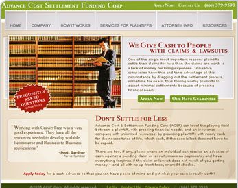
Another of my favorites. This client, specializing in settlement advances for plaintiffs in the middle of a financially draining court battle, came to GravityFree with a name, a very basic logo (the business name spelled out in Times New Roman) and no promotional materials. It's tough to get overly experimental with a business that's based around as visually conservative a field as this one, so I concentrated on a warm, appealing color palette and a solid page layout that's exceptionally easy to navigate. I think one of my general weaknesses is my hesitency to introduce a broad array of colors to my designs, which is something I overcame in this instance to produce a nice all-around look and feel. This site was designed during my tenure as Art Director GravityFree Web Design.
You can find this site on the web at http://www.acsfcorp.com.
|
|


|
|